How Signage for Offices Makes Workplaces Easier to Navigate
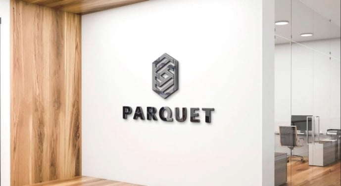
A workplace should be easy to understand, even for someone visiting it for the first time. Signage for offices helps employees, customers and visitors find the right rooms, understand directions and identify different departments without unnecessary confusion. From a small office with a few rooms to a large corporate building with several floors, clear signs make everyday activities easier. When businesses compare options offered by the best signage companies in dubai, they should consider how well the signs communicate information, fit the office layout and serve the people who use the building.
Think about a visitor arriving for a meeting in an unfamiliar office. The reception desk may be visible, but the meeting room could be at the end of a long corridor. Without proper signs, the visitor might need to ask several employees for help. A few clear directions and a room name beside the door can make the journey much simpler.
Office signs are not only used to display a company name. They help people understand where they are, where they need to go and which areas they can enter. When planned carefully, they reduce interruptions, improve organisation and create a more comfortable working environment.
Different Types of Signs Used Inside Offices
Every workplace has its own layout and requirements. The signs needed by a small consultancy will differ from those required by a large company with several departments. Understanding the main types of office signs helps businesses choose what is useful rather than filling the workplace with unnecessary information.
Reception and Entrance Signs
Reception signs help visitors identify a business when they arrive. They may display the company name on a wall, behind the reception desk or near the main entrance. Their purpose is to make the correct location easy to recognise.
For example, several businesses may operate on the same floor of a commercial building. If each entrance has a clear company name, visitors can identify the correct office without disturbing neighbouring businesses.
A reception sign should be visible from the entrance and easy to read. Its size should suit the available wall space, while the lettering and colours should remain clear against the background. A complicated design is rarely necessary when a simple sign can communicate the information effectively.
Meeting Room and Office Door Signs
Room identification signs help employees and visitors find specific spaces. These signs commonly display room names, department names, room numbers or staff roles.
A company with several meeting rooms might use names such as Meeting Room A, Meeting Room B and Conference Room. Using the same naming system across calendars, emails and physical signs helps employees locate the correct room without confusion.
Door signs can also protect privacy. Labels such as “Private Office”, “Interview Room” or “Staff Only” help people understand how a space is used before entering. This is particularly useful when confidential discussions or client meetings take place throughout the day.
Directional and Wayfinding Signs
Directional signs guide people from one location to another. They often include arrows, floor numbers, department names and short instructions.
These signs are useful at entrances, lifts, staircases and corridor junctions. Their placement matters because people need directions before they reach a point where they must choose a route.
For example, a company may have its human resources department on one side of the floor and its accounts department on the other. A directional sign near the main corridor can help visitors reach the correct department without walking through several work areas.
A good wayfinding system uses consistent wording and symbols. When signs follow the same pattern throughout the building, people can understand directions more quickly.
Safety and Restricted-Area Signs
Safety signs communicate important information about emergency exits, fire equipment, first-aid facilities and other safety-related locations. They should be easy to recognise and positioned where people can see them when needed.
Restricted-area signs also have a practical role. Labels such as “Authorised Staff Only” can help prevent visitors from entering storage rooms, server rooms or areas where confidential information is handled.
These signs should use clear language and suitable symbols. Businesses must also consider applicable building and safety requirements when deciding which signs are necessary and where they should be installed.
How Office Signs Improve Everyday Productivity
Employees often lose time when they cannot find meeting rooms, shared facilities or different departments. Clear signs reduce these small delays and help people move through the workplace with less interruption.
Consider a new employee who joins a company with several departments. During the first few days, the employee may need to locate the printer, meeting rooms, kitchen and human resources office. Proper room labels and directional signs make it easier to learn the layout without repeatedly asking colleagues for help.
Visitors also benefit from clear office identification. Reception staff can spend less time giving basic directions and more time assisting with appointments and other responsibilities. Customers are more likely to feel comfortable when they can move through a building without uncertainty.
Another benefit is better use of shared spaces. Signs can identify quiet rooms, meeting areas and shared equipment. Simple instructions can also remind employees to keep walkways clear or return equipment after use.
These improvements may seem small individually, but they can make the working day more organised, particularly in offices where many people share the same facilities.
Choosing Suitable Materials for Office Signage
The material used for an office sign affects its appearance, durability, cleaning requirements and overall cost. The right choice depends on the sign’s location and how frequently people interact with it.
Acrylic Signs
Acrylic is commonly used for reception displays, department labels and room identification signs. It has a smooth finish and can be produced in different colours, thicknesses and shapes.
For example, a business with a modern reception area may choose a simple acrylic sign with clear lettering. Smaller acrylic signs can then be used outside meeting rooms to maintain a consistent appearance throughout the office.
Metal Signs
Aluminium and stainless steel are suitable options for businesses that prefer a durable finish. Metal signs can be used for room names, department labels and selected reception displays.
The finish should suit the surrounding interior and remain readable under the available lighting. Businesses should also consider the installation method, especially when signs are mounted on glass partitions or finished wall surfaces.
Printed Boards and Other Materials
Printed boards can provide a practical option for signs that communicate basic information. They may be suitable for department labels, internal instructions and temporary office arrangements.
Wooden signs can work well in interiors that use natural materials or warm colours. However, the material should always suit the location and the message being displayed.
Before selecting a material, consider how often the sign will be cleaned, whether it is exposed to sunlight or moisture and how long it is expected to remain in place. A sign in a busy corridor may require different materials and fixing methods from one inside a private office.
Making Office Signage Clear and Easy to Read
A sign cannot do its job if people struggle to read it. Clear lettering, suitable contrast and short messages are more important than decorative details.
Text size should match the distance from which the sign will be viewed. A small label beside a door may need less prominent lettering than a directional sign placed near the entrance to a large office floor.
Colour contrast also makes a difference. Dark text on a light background or light text on a dark background is generally easier to read than lettering that blends into the surface. Reflective finishes should be considered carefully because glare from overhead lights or windows can make words harder to see.
The wording should be direct. For example, “Reception”, “Meeting Room 3” and “Exit” communicate information quickly. Long sentences are usually unnecessary on signs that people need to read while walking.
Symbols and arrows can support written directions, particularly in workplaces with visitors from different language backgrounds. However, symbols should be familiar and used consistently. Combining too many symbols, colours and messages on one sign can make the information confusing.
Matching Office Signs with the Workplace Layout
Sign placement should follow the way people move through the office. A sign placed in the wrong location may be difficult to notice, even if its design is attractive.
Start by identifying the main entrance and the places where visitors need to make decisions. These may include lift lobbies, corridor junctions, staircases and reception areas. Directional signs should appear before people reach these points, giving them enough time to choose the correct route.
Room identification signs should be positioned close to the relevant doors. Reception signs should be visible when visitors enter, while safety information must remain unobstructed.
Businesses should also check the surrounding environment. Furniture, plants, open doors and display stands can hide signs. Lighting and wall colour may affect visibility as well.
For example, a sign placed behind a glass door might be difficult to read when the door is open. Moving it to a nearby wall could make it more useful without changing the design.
A short inspection of the office layout before production can prevent these problems and reduce the need for later adjustments.
What to Check When Comparing Signage Companies in Dubai
Choosing a suitable supplier requires more than comparing quotations. Businesses looking at the best signage companies in dubai should consider the provider’s experience with office identification signs, directional systems, reception displays and related workplace requirements.
First, check whether the proposed design suits the actual location. A supplier should understand the sign’s purpose, viewing distance, available space and mounting surface. A design that looks good on a computer screen may not work well on a narrow corridor wall.
Next, review the proposed materials and finishing methods. Ask how the signs will be fixed, how the lettering will be produced and whether the surface requires special care. Clear specifications make it easier to compare different quotations.
Installation should also be considered. Glass partitions, painted walls and decorative surfaces may require different fixing methods. Poor installation can damage the surrounding area or leave signs uneven.
Before approving production, check the spelling, room names, department labels, measurements and colours. Correcting an error after installation can cost more than checking the details beforehand.
Businesses should also confirm the expected production period, installation arrangements and what happens if a sign arrives damaged or contains an error. These practical questions help avoid misunderstandings and support a smoother project.
Common Mistakes to Avoid When Planning Office Signs
One frequent mistake is using too much text. People generally need quick answers when looking for a room or following directions. Short labels and simple arrows are often more useful than long explanations.
Another mistake is changing names between signs. If the office directory says “Customer Service” but the door reads “Client Support”, visitors may wonder whether they have found the correct department. Consistent wording prevents this problem.
Poor contrast and small lettering can also reduce readability. A sign should be designed for its intended viewing distance, not simply to match the wall or furniture.
Businesses sometimes install signs without considering the complete route. A visitor may find the lift easily but become confused after reaching the correct floor. Reviewing the entire journey helps identify where additional directions are needed.
Finally, signs should be checked whenever the office layout changes. A department move, renovation or change in room use can make existing information inaccurate. Regular reviews keep the signage system useful.
Conclusion: Creating a More Organised Office with Clear Signs
Effective signage for offices helps employees work more comfortably and allows visitors to find their destinations with less confusion. Reception displays, room labels, directional signs and safety information each serve a specific purpose. When they are designed and positioned correctly, they improve communication, save time and support a more organised workplace.
Businesses should focus on readable text, suitable materials, consistent wording and practical placement before spending money on decorative features. When comparing the best signage companies in dubai, they should look for relevant experience, clear material specifications and careful installation practices.
The main purpose of office signage is simple: people should be able to understand their surroundings without unnecessary effort. By planning signs around real workplace needs and reviewing them regularly, businesses can create an environment that is easier to navigate, more comfortable to use and better organised for everyone.